
The Brand
Alphabet City is a casual bar & Mexican restaurant on Vancouver’s Main Street.
They are under new ownership and the name is a relic from the previous owner.
They want to do a full rebrand including renaming, but aren’t sure of the new name yet.
They are in urgent need of a rebrand, so we decided to go ahead with a rebrand that will work with this temporary name and the new name.
The visuals are tied to the desired new vibe of the bar, not the old name. There is less focus on the wordmark so the branding will work in the interim and when continue through when the bar is renamed.
We wanted to go for a casual, elevated Mexican feeling without being theme-y.
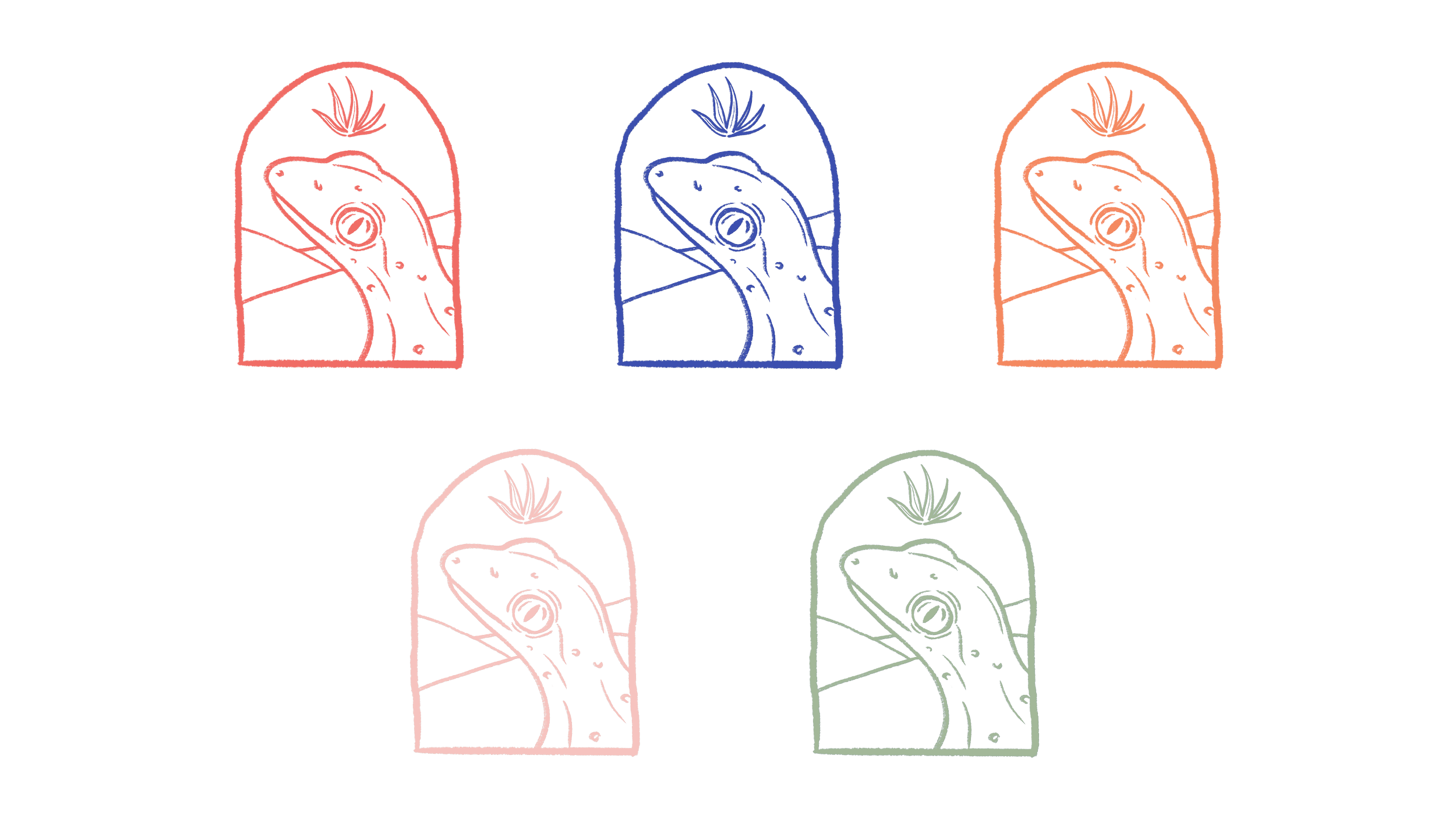
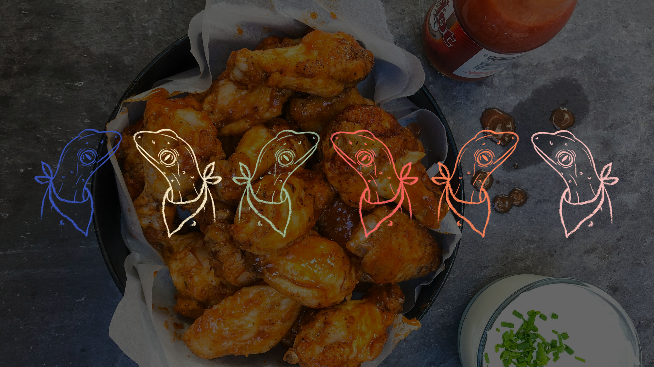
Hand drawn, versatile illustrations featuring a cheeky gecko give the identity strength and charm.
The gecko is the perfect mascot for this brand with its ties to Mexico, the desert and its strength, resilience and ability to adapt.
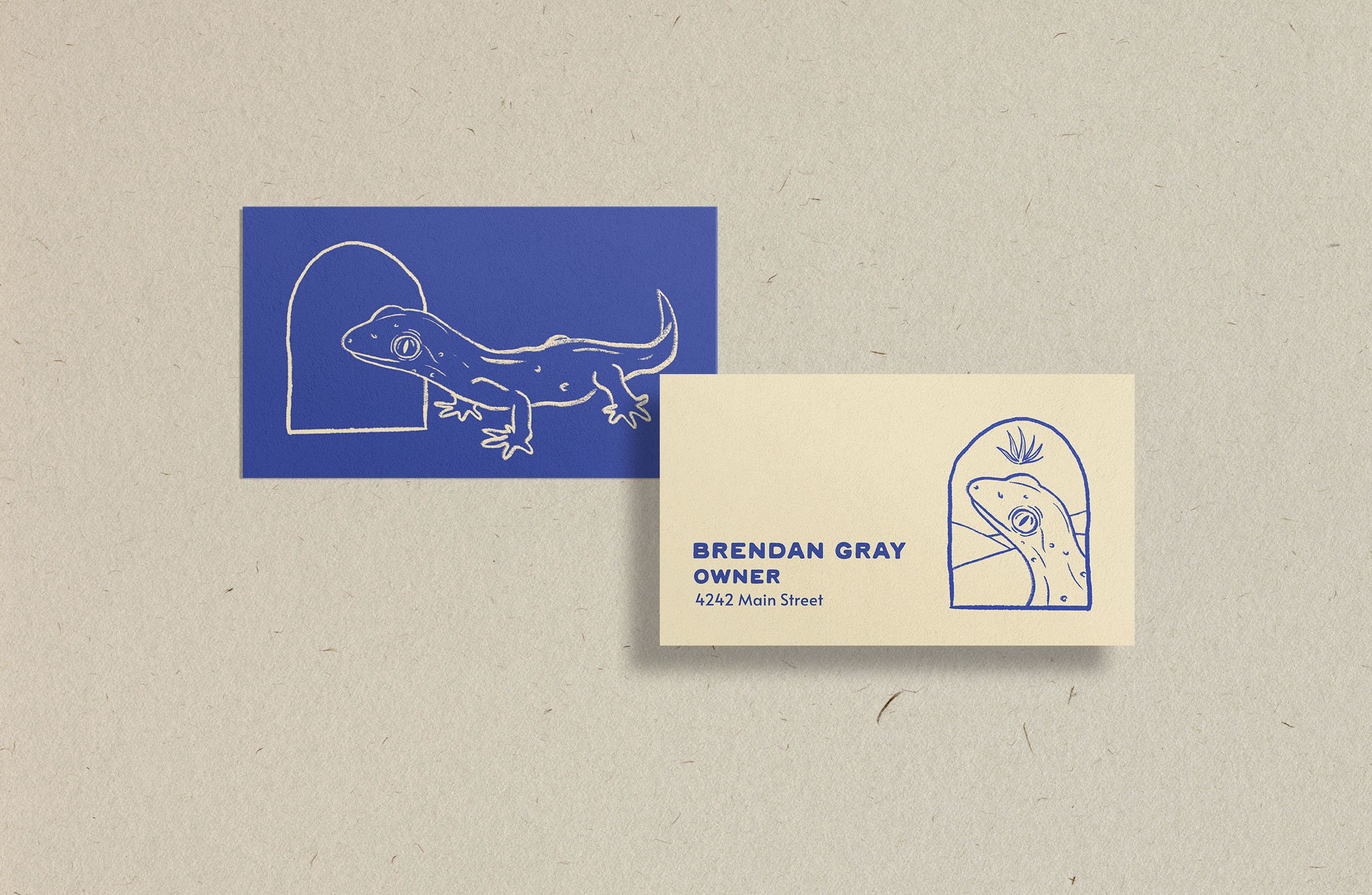
The playful story of the gecko can be seen on the business cards and the menu.
The humble gecko happens upon a window, looks through it and is caught in a moment. The window frames him as a temporarily exalted king of the desert complete with an agave crown.
The double sided nature of the cards and menu work to tell this story and make you feel as though the gecko is there, running around the menu, running through both sides, leaving footprints, stealing your drink and causing chaos before taking a nap in a tortilla.
The Scope
Brand Strategy, Brand Positioning, Brand Identity, Brand Design, Printed Collateral Design, Social Media Strategy and Content, Website Design.
Website Walkthrough
Animation showing the gecko discovering the window and wearing his crown.
Interactive business card

Illustration

Food wrapping paper and coaster design
Logo guys

Frames for social posts
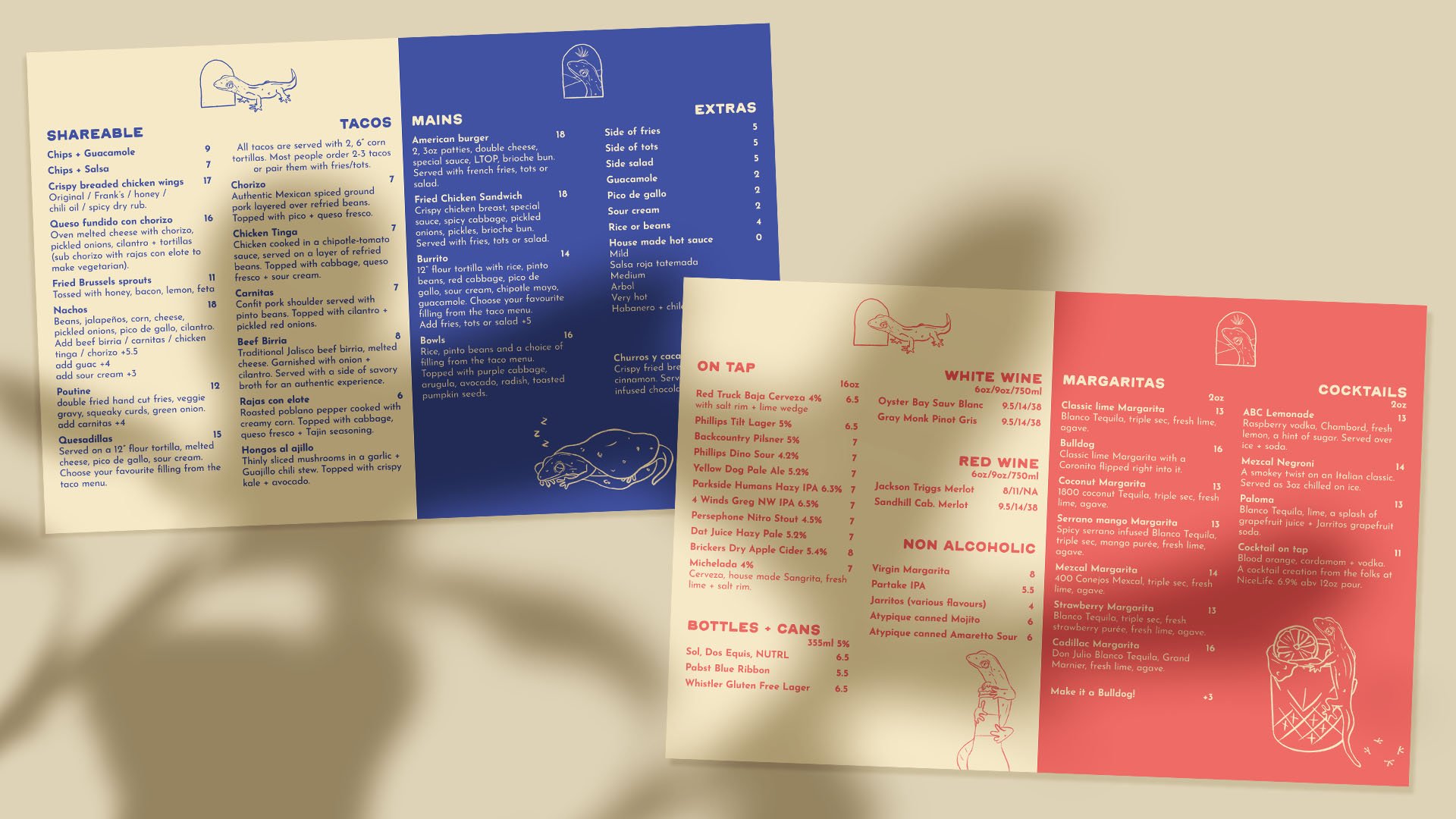
Menu design showing the gecko causing chaos

Colour palette

Take out bag and sticker design

Gecko causing chaos with drinks
Napkin boys
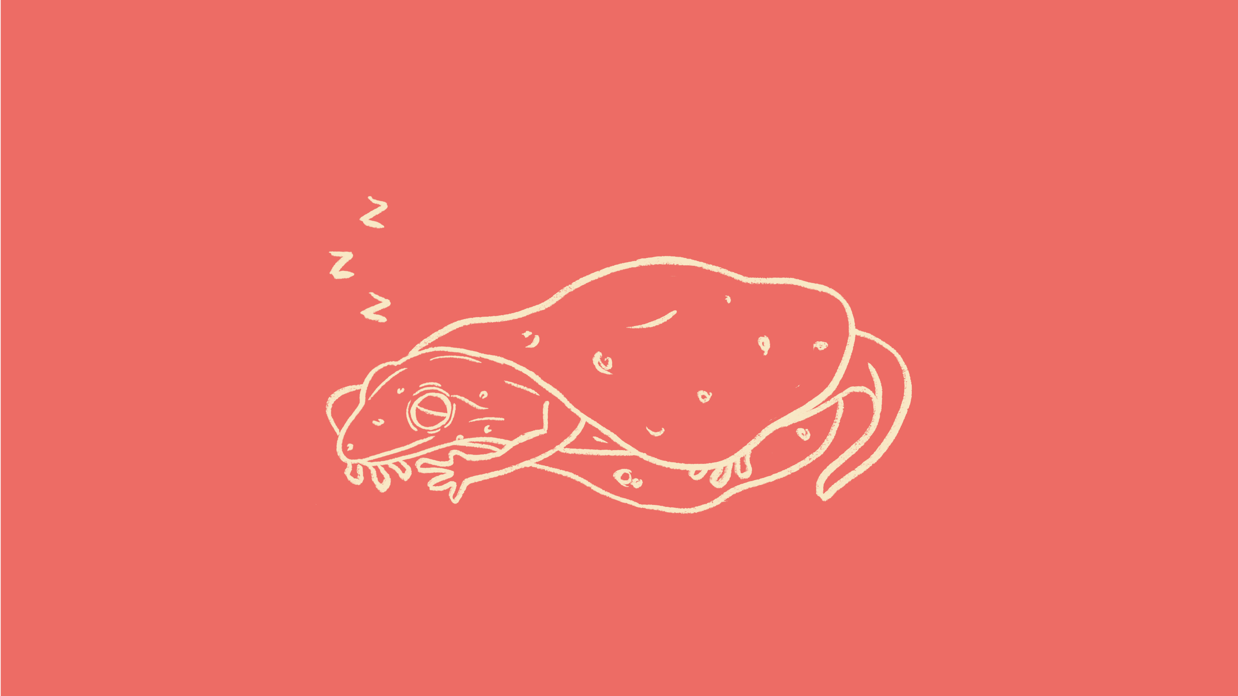
Gecko taking a nap in a tortilla

Supporting illustrations
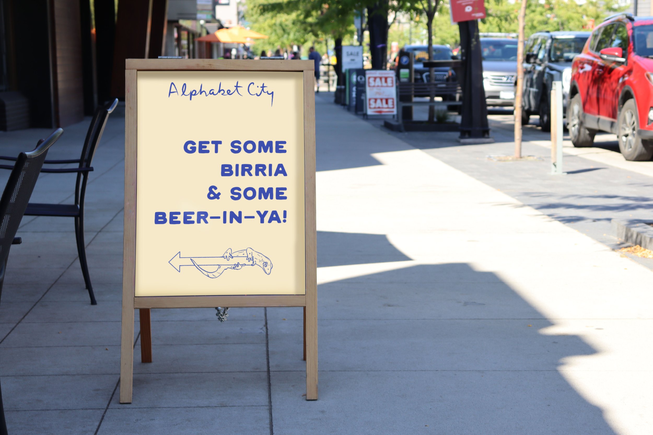
Everyday sandwich board

King Salsa
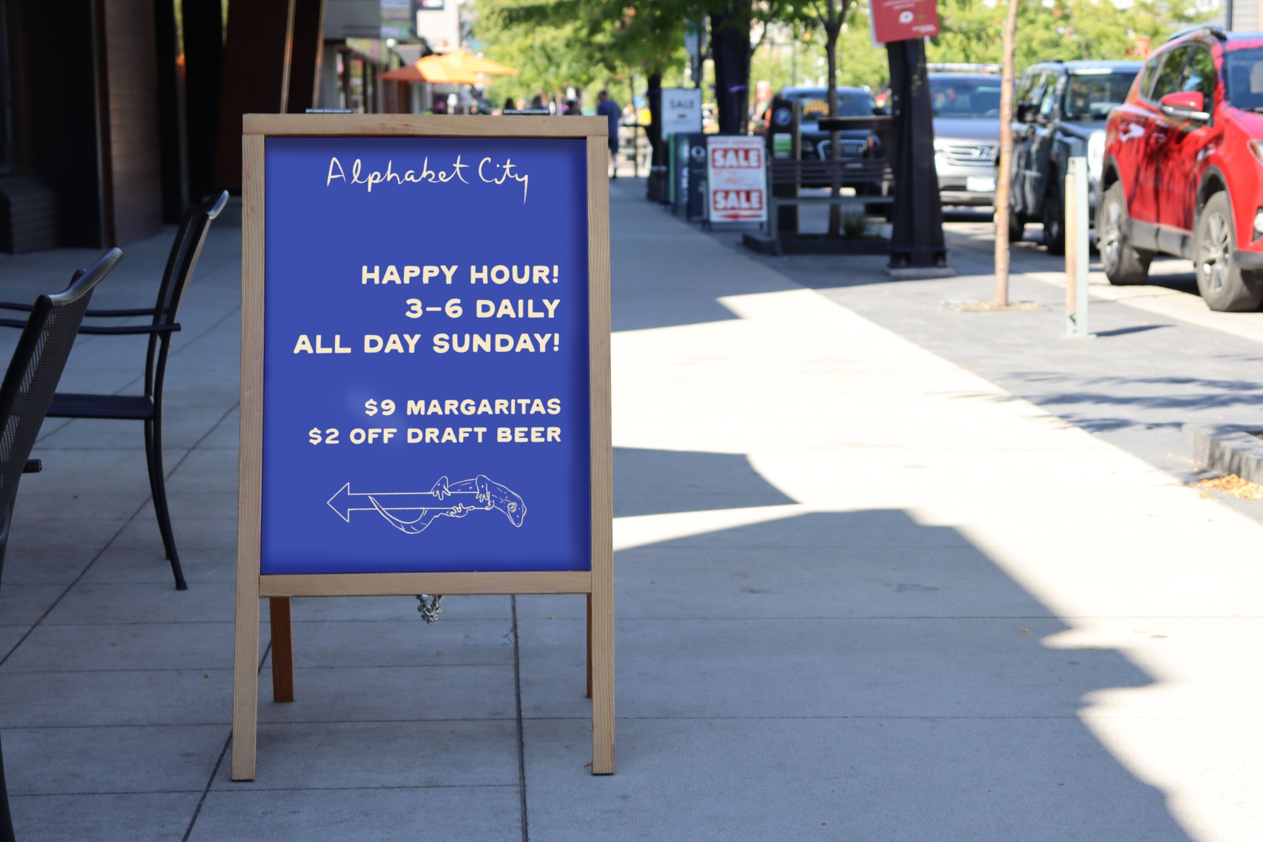
Happy Hour sandwich board

Window front mock up
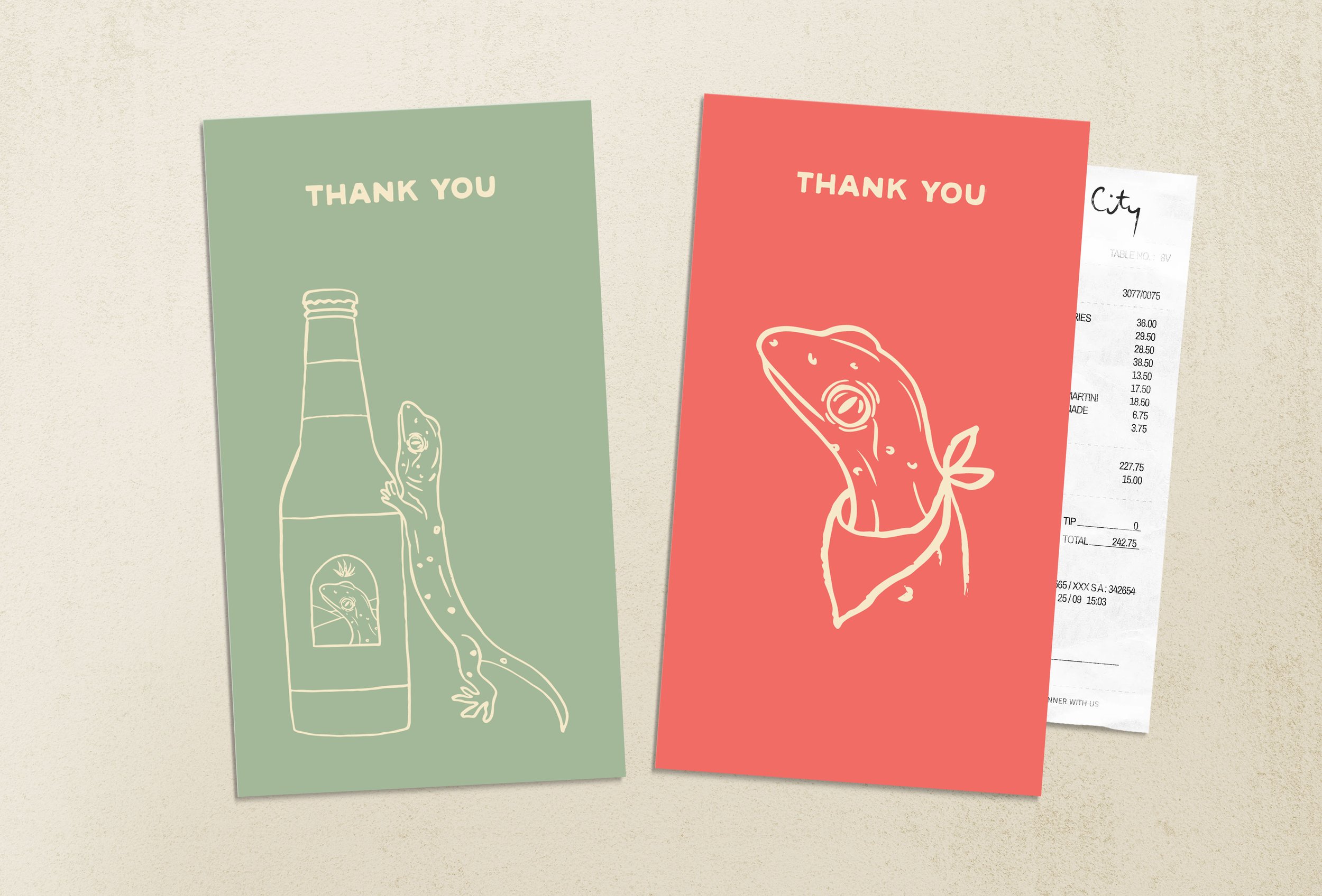
Thank you bill cards
